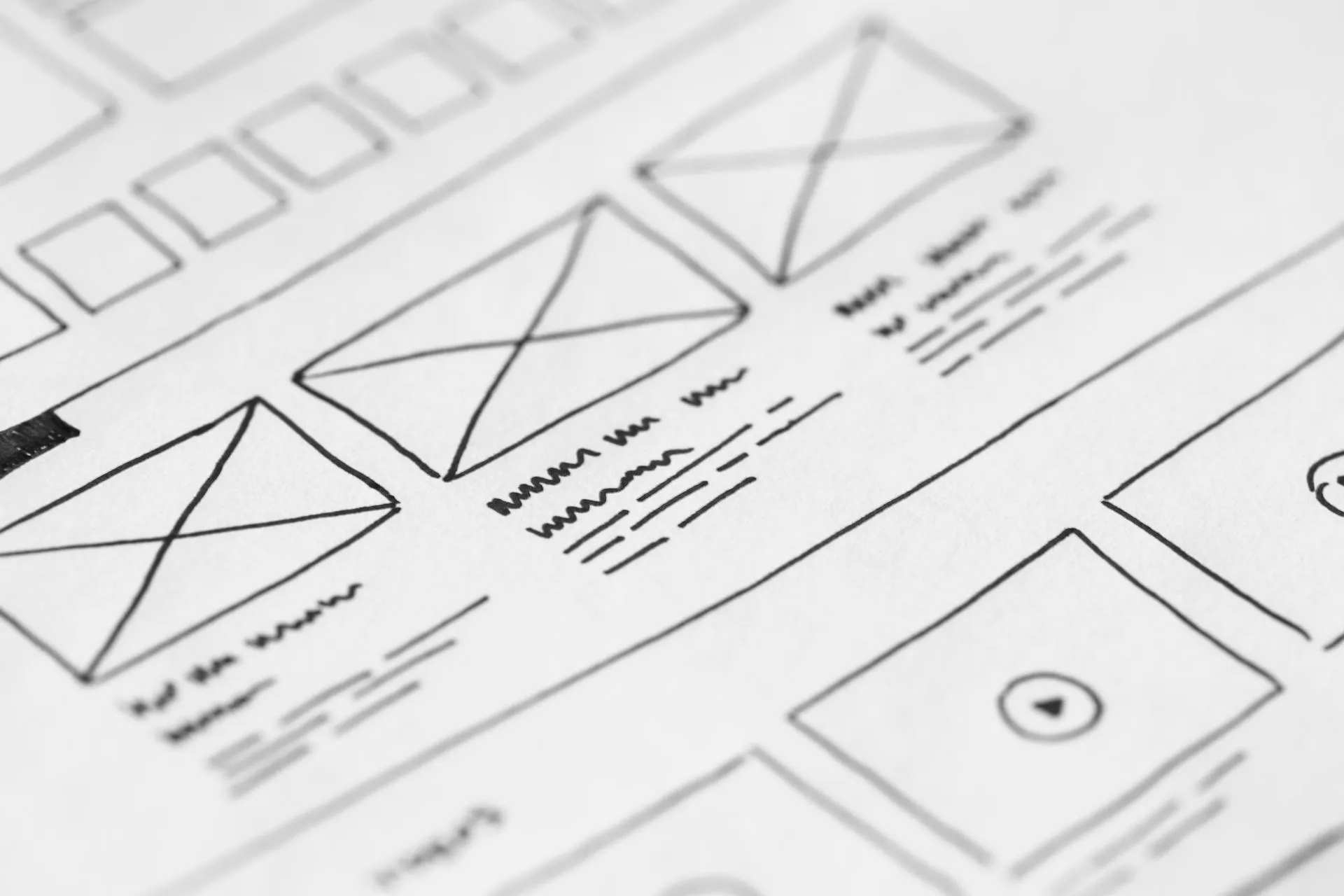
Create Professional High Converting Landing Pages
Boost lead generation with expert landing page design. Proven strategies for content, conversion optimization, and design principles for your service business.

A well-designed landing page is crucial for service businesses looking to convert website visitors into qualified leads. As experienced web designers, we’ve helped numerous Australian businesses create landing pages that not only look professional but also drive real business results.
Understanding Landing Pages
A landing page is a standalone web page specifically designed to convert visitors into leads or customers. Unlike your main website pages, landing pages have a single focus and clear call-to-action (CTA). For service businesses, this typically means capturing contact information from potential clients interested in your services.
Why Landing Pages Matter for Service Businesses
- Focused Messaging: Target specific services or customer segments
- Higher Conversion Rates: Dedicated pages convert better than general website pages
- Better Lead Quality: Qualified leads through targeted content
- Measurable Results: Easy to track and optimise performance

Essential Landing Page Elements
1. Compelling Headlines and Subheadings
Your headline is the first thing visitors see and should immediately communicate your value proposition. It needs to:
- Address the visitor’s primary pain point
- Promise a clear benefit
- Be concise and attention-grabbing
Example of an effective headline structure:
Main Headline: "Transform Your [Service Area] Business"
Subheading: "Get [Specific Benefit] Without [Common Pain Point]"
2. Clear and Persuasive Copy
The copy on your landing page should follow the AIDA formula:
- Attention: Grab interest with compelling headlines
- Interest: Build engagement with relevant benefits
- Desire: Create emotional connection through pain points and solutions
- Action: Guide visitors toward your CTA
3. Effective Call-to-Action (CTA)
Your CTA is the conversion point of your landing page. It should be:
- Visible: Use contrasting colours and prominent placement
- Clear: Use action-oriented text (“Get Your Free Quote” vs “Submit”)
- Urgent: Create a sense of immediacy
- Value-Focused: Emphasise what they’ll receive

4. Trust Elements
Build credibility through:
- Client Testimonials: Real feedback from satisfied customers
- Trust Badges: Industry certifications and partnerships
- Social Proof: Numbers and statistics showing your impact
- Case Studies: Detailed examples of successful projects
Design Tips for Maximum Conversions
Visual Hierarchy
Guide visitors’ attention through:
- Strategic Layout: Place important elements above the fold
- White Space: Use breathing room to highlight key elements
- Contrast: Make CTAs and important information stand out
- Directional Cues: Use visual elements to guide attention to CTAs
Mobile Optimisation
With over 60% of web traffic coming from mobile devices, your landing page must be mobile-friendly:
- Responsive Design: Adapt to all screen sizes
- Touch-Friendly: Large buttons and easy-to-tap elements
- Fast Loading: Optimised images and minimal code
- Simplified Forms: Only essential fields on mobile
Learn more about optimising your website for better performance.
A/B Testing and Optimisation
Continuous improvement through testing is crucial for maximising conversions:
Elements to Test
-
Headlines
- Different value propositions
- Various headline formats
- Emotional vs logical appeals
-
CTAs
- Button colours and sizes
- Text variations
- Placement on page
-
Forms
- Number of fields
- Field order
- Form layout
-
Images
- Different types of visuals
- Placement and size
- With vs without people
Measuring Success
Track these key metrics:
- Conversion Rate: Percentage of visitors who complete your goal
- Bounce Rate: Visitors who leave without taking action
- Time on Page: How long visitors engage with your content
- Form Abandonment: Where people drop off in your form
- Heat Maps: Where visitors click and scroll

Common Landing Page Mistakes
-
Too Many Options
- Multiple CTAs creating confusion
- Unnecessary navigation menus
- Competing offers or messages
-
Weak Value Proposition
- Generic benefits
- Focusing on features instead of outcomes
- Not addressing customer pain points
-
Poor Form Design
- Too many fields
- Asking for unnecessary information
- Lack of clear error messages
-
Slow Loading Speed
- Unoptimised images
- Heavy scripts and plugins
- Poor hosting performance
Getting Professional Help
While these principles can guide your landing page design, creating a high-converting page often requires professional expertise. Our web design services include:
- Custom landing page design
- Conversion rate optimisation
- A/B testing implementation
- Mobile-first responsive design
- Integration with your marketing tools
Next Steps to Your High-Converting Landing Page
Ready to create a landing page that converts? Here’s how to get started:
- Define your specific conversion goal
- Identify your target audience’s pain points
- Craft your unique value proposition
- Gather trust elements (testimonials, case studies)
- Plan your content and visual hierarchy
Need help creating a high-converting landing page? Our team of web design experts can help you develop a custom landing page that drives results for your service business. Contact us for a free consultation and website review.
Remember, a successful landing page is never truly finished. Regular testing and optimisation based on user behaviour and conversion data will help you continuously improve your results and generate more leads for your service business.